
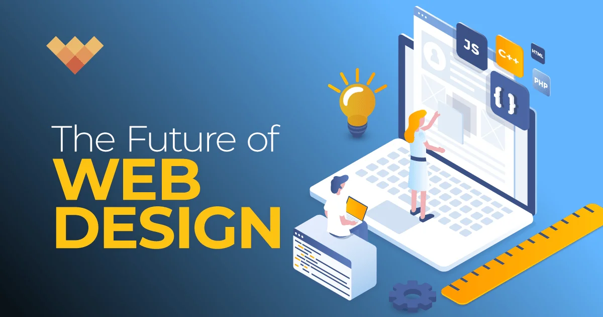
In the ever-evolving world of web design, few ideas have created as much buzz lately as Pxless — a term that captures the shift away from fixed pixel-based layouts toward flexible, scalable, and adaptive design systems.
Whether you’re a designer, front-end developer, or digital strategist, understanding what Pxless means, how it works, and why it matters can redefine how you build modern web experiences.
In this comprehensive guide, we’ll explore everything about Pxless design, from its core philosophy and technical foundations to its applications, tools, and impact on the digital future.
1. What Is Pxless? The Meaning Behind the Term
“Pxless” originates from the abbreviation of “pixel-less,” symbolizing a design methodology that minimizes reliance on pixel-based units in web design.
In traditional front-end development, designers use pixels (px) as a fixed measurement to define element sizes, spacing, and typography. While precise, this method can be rigid — especially across devices with vastly different screen sizes and resolutions.
Pxless design challenges that paradigm by focusing on relative, scalable, and fluid units, such as:
-
em and rem (for typography and spacing relative to root font size)
-
vw and vh (for viewport width and height)
-
% (percent) for responsive layout widths
-
fr (in CSS Grid for flexible fractions)
So, Pxless isn’t just a buzzword — it’s a mindset shift toward designs that adapt gracefully, ensuring a seamless user experience on mobile, tablet, desktop, and beyond.
In essence, Pxless = Pixel-independent design.
2. The Problem With Pixel-Based Design
For decades, pixels ruled the web. Early HTML and CSS used fixed-width layouts, and designers built for standard screen sizes like 1024×768. But as technology advanced, pixel-based design started to show its cracks.
Key Limitations of Pixel-Based Design:
-
Inflexibility Across Devices – A design built in pixels looks perfect on one screen but may break on another.
-
Accessibility Issues – Fixed font sizes don’t respect user preferences for larger text.
-
Maintenance Complexity – Every new screen type requires manual adjustment.
-
Performance Bottlenecks – Overly detailed pixel layouts add unnecessary CSS rules.
-
Poor Scalability – Pixel-perfect design often sacrifices usability for aesthetics.
A pixel is an absolute unit — great for static images, but web design is a living, dynamic ecosystem.
That’s why modern frameworks and CSS specifications have shifted toward responsive design principles — and that’s exactly where Pxless shines.
3. The Core Philosophy of Pxless Design
At its heart, Pxless design is about flexibility, scalability, and accessibility. It embraces the idea that web experiences should adapt to users—not the other way around.
Here’s the philosophy broken down:
-
Fluidity Over Fixation: Instead of forcing a rigid layout, Pxless allows elements to flow naturally within containers.
-
Content-First Design: Designs are built around the content’s importance and readability.
-
Device Independence: No more “desktop vs. mobile” mindset — Pxless ensures uniform experience across resolutions.
-
User-Centric Accessibility: Typography scales with user preferences and device capabilities.
-
Performance Optimization: Simplified, clean CSS structures reduce rendering load.
The Pxless approach promotes design freedom while maintaining consistency. It encourages developers to think in relationships, not restrictions.
In short: it’s not about making things smaller or bigger — it’s about making them smarter.
4. How Pxless Works: Technical Foundations
Let’s get technical for a moment.
Pxless design relies on relative CSS units, viewport scaling, and responsive design frameworks. Here are the essential building blocks:
A. Relative Units
-
em: Relative to the font size of the parent element.
-
rem: Relative to the root (HTML) font size — ensures global scalability.
-
% (percentage): Defines width/height relative to container.
-
vw/vh: Based on viewport width or height.
Example:
B. Viewport Responsiveness
Viewport units make elements scale dynamically:
C. CSS Grid and Flexbox
Modern layout systems like Flexbox and CSS Grid make Pxless layouts easy to manage:
D. Fluid Typography
Instead of fixed pixel fonts, use clamp() for responsive scaling:
Together, these techniques enable truly fluid, pixel-independent design.
5. The Rise of Pxless Frameworks and Tools
The Pxless philosophy isn’t just theoretical — it’s actively shaping modern design tools and frameworks.
Popular Pxless-Ready Frameworks:
-
Tailwind CSS – Uses rem-based spacing by default, ensuring scalable design.
-
Bootstrap 5+ – Shifted away from pixel values toward relative units.
-
CSS Grid & Flexbox – Natively Pxless layout systems.
-
Figma Auto Layout & Constraints – Visual tools that mimic Pxless responsiveness.
-
Framer & Webflow – Low-code design platforms emphasizing fluid scaling.
Emerging Tools Supporting Pxless:
-
Pxless.io (Concept Tool) – A growing platform for unit-free CSS generation.
-
Modern UI Libraries – Many new libraries now default to rem and fr units.
This movement reflects the industry’s recognition that pixel-based design is outdated. Pxless is the new default for flexible, modern web creation.
6. Why Designers and Developers Are Adopting Pxless
The shift toward Pxless design isn’t just technical — it’s strategic.
Here’s why creative professionals are making the switch:
-
Seamless Responsiveness: Sites automatically adapt to any screen size.
-
Simplified Workflow: Fewer breakpoints and layout hacks.
-
Accessibility Boost: Relative font sizes respect user zoom settings.
-
Scalability: Design systems scale without recalculating pixel grids.
-
Future-Proofing: With new devices emerging (AR/VR, watches), pixel-perfect thinking becomes obsolete.
For agencies and developers focused on UX and performance, Pxless design is a win-win — it’s faster to build, lighter to load, and easier to maintain.
7. Pxless Design vs. Pixel-Perfect Design
To appreciate Pxless fully, let’s contrast it with the old-school pixel-perfect mindset.
| Aspect | Pxless Design | Pixel-Perfect Design |
|---|---|---|
| Measurement | Relative (em, rem, %) | Absolute (px) |
| Flexibility | High | Low |
| Device Compatibility | Universal | Limited |
| Accessibility | Excellent | Often poor |
| Maintenance | Easier | Complex |
| Visual Consistency | Adaptive | Static |
| Ideal Use | Responsive, scalable designs | Fixed-size layouts |
In summary, pixel-perfect is about control, while Pxless is about adaptability.
The web is no longer static, and neither should your design philosophy be.
8. Real-World Applications of Pxless Design
A. Responsive Websites
Companies like Airbnb, Shopify, and Apple leverage Pxless techniques to deliver smooth, device-agnostic experiences.
B. Progressive Web Apps (PWAs)
Pxless ensures that PWA interfaces scale efficiently across browsers, resolutions, and platforms.
C. E-Commerce
Fluid grids and rem-based product cards allow stores to load beautifully on any device.
D. Content Platforms
News, blogs, and media sites benefit from Pxless typography and flexible layouts.
E. Digital Accessibility
Pxless design ensures compliance with WCAG 2.2 standards, offering better readability for users with visual impairments.
The result: a web that’s inclusive, consistent, and user-first.
9. Challenges and Misconceptions About Pxless
Every revolution faces skepticism. Some designers fear that Pxless means losing precision or control. That’s a myth.
Common Misconceptions:
-
“Pxless means sloppy design.”
→ False. Pxless enhances consistency through relative scaling. -
“You can’t control layouts precisely.”
→ You can—using Grid, Flexbox, and clamp() logic. -
“Pxless design breaks on small screens.”
→ The opposite. It’s built for small screens. -
“Accessibility suffers.”
→ Pxless improves accessibility by respecting system preferences.
Real Challenge:
The hardest part is the learning curve. Designers must unlearn decades of pixel-based habits. But once mastered, Pxless simplifies long-term workflows dramatically.
10. The Future of Pxless: A New Era of Digital Design
The Pxless movement represents more than a coding trend — it’s a paradigm shift for digital creation in 2025 and beyond.
As devices diversify—from foldable phones to smart TVs and AR displays—static, pixel-based layouts simply can’t keep up. The Pxless future promises:
-
AI-Driven Adaptive Design: AI tools will auto-generate Pxless layouts optimized for every device.
-
Code-Free Responsive Builders: No-code and low-code platforms are adopting Pxless scaling by default.
-
Cross-Reality Interfaces: Pxless design principles are foundational for mixed-reality environments (AR/VR).
-
Smarter Accessibility Engines: Future browsers will dynamically adjust Pxless sites for disabilities.
The Pxless web is a web that grows, shifts, and scales—without breaking the experience. It’s not just “responsive” anymore—it’s alive.
Conclusion: Why Pxless Is the Future You Can’t Ignore
The web of the future is not pixel-bound—it’s fluid, intelligent, and adaptive.
Pxless design offers the perfect balance between creative freedom and technical scalability. It encourages designers to think beyond fixed grids and focus instead on user experience, performance, and universal accessibility.
Whether you’re coding your first website or managing enterprise-level projects, adopting a Pxless mindset is your gateway to building timeless, device-independent experiences.
So next time you reach for a pixel unit, pause—and ask yourself:
“Could this be Pxless?”
Chances are, the answer will move your design one step closer to the future.
FAQs
1. What does Pxless mean in web design?
Pxless means “pixel-less,” referring to design systems that avoid fixed pixel units, using relative measurements for scalable layouts.
2. Is Pxless the same as responsive design?
Not exactly. Responsive design is part of Pxless philosophy, but Pxless emphasizes a broader approach—focusing on flexibility, accessibility, and device independence.
3. What are examples of Pxless units?
Common Pxless units include rem, em, %, vh, vw, and fr in CSS.
4. Can I use Pxless design in mobile apps?
Yes. Pxless principles apply to mobile, web, and even hybrid app designs—especially those using frameworks like React Native and Flutter.
5. Will Pxless replace pixels completely?
Not entirely. Pixels still serve purposes in images and certain UI elements. However, for layout and typography, Pxless design is the future.